MEET ANDY MORO – THE SET DESIGNER FOR FROZEN RIVER
Based in Calgary, Andy Moro is a multidisciplinary artist, whose stunning set and original lighting design were seen on MTYP’s stage during The Mush Hole last February Now, for the first time, MTYP is honoured to be working with Andy as Set Designer for the world premiere of Frozen River. We had the opportunity to speak with Andy in December about the work he is doing for this project.
So is this the first project for children’s theatre (TYA)?
I cofounded an organization in Toronto where we created theatre and film with Indigenous youth. In terms of actual TYA work, I haven’t done a lot, but I love it. There is a freedom with shape, colour and content that doesn’t always exist.
Do you approach designing for children’s theatre any differently than you would for adult theatre?
I respond to story in the same way. I don’t change my approach. It’s the integrity of the content that informs the world. Young audiences connect story dots in a sophisticated way. Things don’t have to be rationalized or explained in the same way. This is a space ship. Period. It’s not even a question. That part of it feels good.
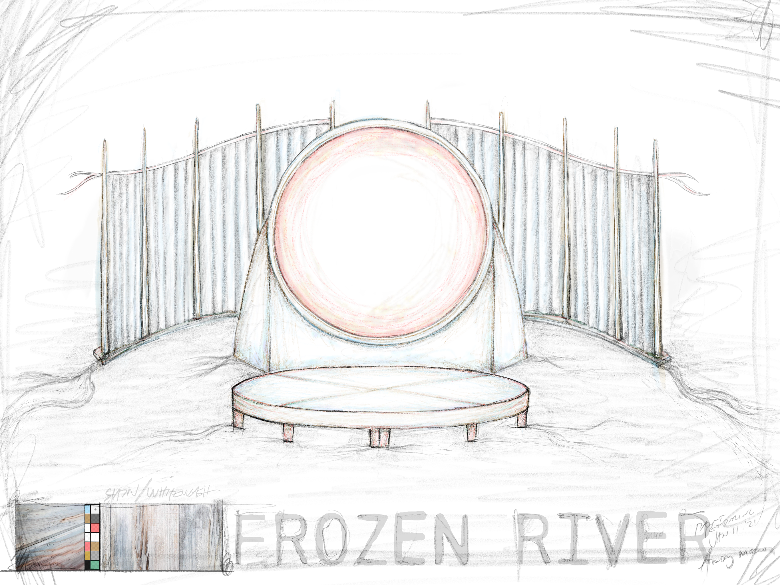
I saw the preliminary drawing of the set. It looks spectacular. What were the main challenges when creating this design?
The amount of world-time the story crosses is one – but an even bigger challenge is that it has to set up by the cast and crew in thirty minutes – and fit in the back of a truck. There are lots of issues within the story that require attention and sincerity. But to do that and then fit in the back of a truck in half an hour, those are real challenges.
Talk a bit about your process.
My approach is a combination of architecture and installation art. I try and find an essential iconography that works, starting with basic shapes that tell us where we are. I knew right away that we needed transformation within the set. Sometimes we’re inside a homestead, then a tipi on the bank of a river, then in front of a school. Without

being literal, how do we create a world that can be accepted without adding layers. I like to first see how iconographic we can be – to get at the essence of what all those places are. Simple strokes that can say “now we’re going over here” through time and space – and we do.
The blood moon figures largely in Frozen River. A blood moon can be a harbinger of change or a cleansing on its way. What does the blood moon mean to you?
Purification. The centre of this story is moon, that’s why the circle features so centrally in the design. In Indigenous iconography and spirituality the circle is everything. Even though circles are harder to build from our commercially available materials, I try to incorporate circles every chance I get. The team at MTYP is incredible – one of the best in the country – so we can make what we can dream.
Our life cycles are directly connected to the moon. I often repeat the story of why there are only 12 months on the Christian calendar. It is said that the Patriarchy decided it would be dangerous to connect the cycles of the cosmos to the female cycle because it would give women too much power. The 12 month calendar never really works – we have leap years just to compensate. A 13 month calendar would simply work. That’s literally how the world turns.
Frozen River transgresses those inventions and gets to the core of the animal people, the plant people, and the human people. I just love that the moon is so central to this story.
Are you also using traditional materials when constructing the set?
There is an interesting line between using traditional materials and intentionally not using them – both out of respect. Of course, I spoke with people from this territory to find out what their snare, basket, tipi, etc styles are – to make sure we’re respecting and understanding those ways – those living traditions.
It is most important is that it’s never done in a superficial or generic way. If it isn’t yours, just ask for permission and guidance.
Those design aesthetics, materials and methods are supreme. From, for and returned to, the land. In this storytelling, the light of the moon – that translucency – and the shadow work has become more and more important so specific,accessible materials have been employed to serve that story mandate.
We started off considering actual birch bark, for example. But then I wondered How do we make it glow a little bit? We’re working with original patterns but we’re making them out of printed transparency so it looks like birch bark but light passes through it. We can employ those ideas in our storytelling, with theatrical tools – as opposed to using the real thing.
With a title such as Frozen River, there is a feeling of crossing from one shore to the other. Did you spend time just looking at rivers as part of your process?
I start by reading the script. And then I go on an image search, where I grab the images that resonate, before I know why. We looked at a lot of close ups of ice, beautiful veins and patterns. Time is reflected in that ice. Pressure is reflected in that ice. So much is present there. I don’t know how many words for ice there are, but there are probably many. Indigenous etymology tells the story of the land.
Where water meets the shore, those currents and veins that flow and the cycles of seasons and so on. We looked at shapes, of the bank of the river, and what ice does, and what snow does, and how it’s soft but tremendously transformative. Powerful.
There is something about rivers and ice that hold memory and also so much power.
I remember being up north on James Bay, in Fort Albany. There’s a white Fort Albany and a reserve Fort Albany. The reserve side is on a small island. The river that passes between the two isn’t that wide. In the wintertime the ice is solid and you can go back and forth – you can drive on it. It’s all fine. When the thaw starts in the spring, there are two or three months where mountains of ice fly down that river. It’s impassable.
It got me thinking of that power and force and how much that cycle determines people’s lives. It also made me realize why the white side is on the mainland. Folks on the reserve have to plan way ahead – or get a helicopter to get groceries. There’s no hospital on the reserve side. The massive power of the river used as a colonial tool. That was my first exposure to what that kind of power does. Ugly. It is so very wrong to abuse that power for greed.
Is there anything else about working on Frozen River that’s unique?
Because this play is in development, I work hard to respond to those themes and then create a palate for us to work on. I’m just one brush stroke out of many out there I must make space for those layers to be added. I’ll stay connected as we move through to say: Oh, it would be awesome if that part of the wall opens up or if that section of the floor can flip over. There’s a kinetic quality to this work that I know is coming. That’s why I’ll be glad to be spending time together during that process. That’s where the magic happens. I wish we had a year to work on every show because it takes that kind of time to really find that sort of magic.
Is it important to you that Indigenous people see that where they live is a magical place?
That always matters to me. I’m mixed blood, and I pass. There’s a profound amount of systemic stuff that I am not forced to swallow. I carry that awareness and respect in my throat. I hardly know how to speak to how strong are the innocent, brilliant people living that, stuck in that hell on a day-to-day basis. Those brothers and sisters who are hurt or worse simply because of the skin they’re in in an occupied state. There is nothing more heinous on this planet.
Do I want my work to resonate with that powerful, resilient, resourceful, proud and growing community? There’s nothing I want more. Indigenous art is smarter and cooler than everything else – so if I make something that resonates, that’s the best it gets.